It looks like we've locked onto a solution for maintaining a blog within our new portal. By using an iframe we can quickly and easily integrate a blog into the portal structure while still retaining the attributes of the original blog platform.
We will still have access to all of those same widgets, plugins, themes, etc. which means we will be able to blog in the comfort of familiar surroundings. This, in turn, should make for more frequent and better stories since we'll have a whole new portal to tell you all about!
We have some great new screenshots of our new business-to-business (B2B) page on our soon to be released DELIVER portal. If you are a current or future customer of UNHRD (United Nations Humanitarian Response Depot) you will be able to access all of your transactional information online via the portal. Mind you, these might not exactly match the final product but we wanted to give you a sneak peak at what we're working on just to prove that Pavlov was right.
First stop is the order summary:
Here you can see your order ID#, Status, Last Action, Description and some additional information. This way you'll be able to view your order history before drilling down into the individual documents.
Located just below the summary are additional items which offer access to a whole range of information:
Lastly, we provide with portlet on the right side of the screen that gives you instant access to all of your docs and even shows you which docs are missing:
Incredibly cool stuff that we anticipate releasing into the wild in the coming weeks. Take a look and please don't hesitate to comment below!
Exactly 20 years ago, Berners-Lee, a guy at CERN, had the idea of linking documents with eachother. He invented a special protocol and 'programming language' for it: hypertext. And boom! The World Wide Web was born. 1989.
So, why not celebrate this great day by taking a little time to stretch your thinking about the Web just a bit.
Go on, make yourself a cup of tea, relax… and watch the great TED video above, in which Tim Berners-Lee explains how he invented the World Wide Web - and sheds some light on how he believes his brainchild will evolve in the future.
In this short talk, Berners-Lee explains how the World Wide Web all began because he wanted to refine the way we use information and work together - and, apparently, because his boss humoured him and agreed that he could spend time on it on the side as a “play project”. All bosses with bright staff - take note!.
But this is just the beginning. The future, Berners-Lee explains, will comprise evolving from the current ‘linked documents’ approach to a ‘linked data’ approach. This is the next revolution. Releasing, repurposing, and re-using the infinite wealth of data we collate - from medical research databases to data on relationships held on social networking sites - by linking it up in previously unconsidered ways to support previously unachievable applications.
While I was watching the video, I was thinking: this is EXACTLY what we are trying to do with the portal. FREE THE DATA! No more boxing up the data within our organisation, but making it all accessible for operations people to make operational data, and for managers to make informed decisions.
Or let their staff make informed decisions...
But seriously. Think about it. We have collected Compas data, food commodity tracking data for the past 10 years. What a mass of data. A wealth of data... Think what we can use that data for.
Thanks to the Supply Chain Optimization team (Temmy and Co) from the Logistics Development Unit, we will have the first glimpse of the possibilities, on the new portal.
Here is an overview of the pipeline and the food corridors for Uganda:
Each corridor shows the average transit time, based on the past x months. Each corridor can be clicked and historical data is displayed. All on the spot:
Today is an important day for us... In the "life of a car", this is where the first model runs off the production line, and engineers + designers alike, look at it to check if this is what they had in mind.
In the life of a Portal, this is the day where the developers hand over a product to the 'business', and the latter checks if this is what was requested.
No matter how well the specifications were drilled down, there are always surprises. The challenge for us all is to, in one month, identify the discrepancies and get a product released to our users.
One month.
Picture courtesy Norwegian support team, Pakistan earthquake
These are troubled times in the life of any project: the closer one comes to the delivery dates, the more all different components of a project come together.
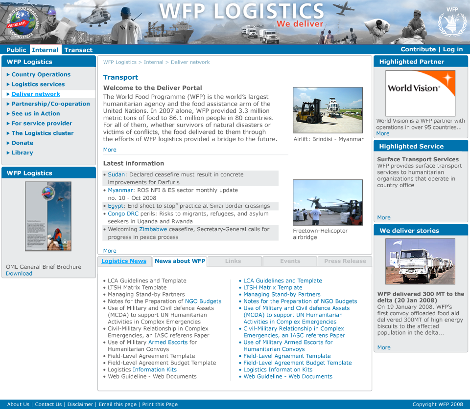
The front-end of the Deliver systems is the Portal, the giant website that will give access to all data WFP logisticians need. It will also be the information repository for the general public AND the main "shopping window" where any humanitarian organisation can request us for logistics services.
The Portal needs to be good. Let me correct that. The Portal needs to be perfect. But the "more perfect", the longer it takes, and often the more complex the development.
Since a year, we have been working on the development of the Portal. From the try-out sites - testing technology, business flows, information gathering - to extensive business requirements gathering, system specifications and development. From contents gathering, development of back-end systems to graphical layout.
The release date for the full Portal was set to March 2009. And it still is... But now is the time where the different 'project streams', the shackles of the chain, are coming together:
Our corner stone is the ICT department, our technical implementation partner, coordinating all the technical issues. For the Deliver Portal, they made the bold move of selecting a completely new technical platform for web development. Loads of challenges come with that. If anything, they are the heroes of The Portal.
Many different logistics units have been writing pieces of content, which we will use as main information pieces, briefings or teasers on the portal.
The Logistics Development Unit, worked with the business units to gather what information is needed for people to do their work more efficiently, and mapping it out to a great technical detail.
We worked on the user-experience end of the Portal (the navigation, the graphical layout, the usability)
The UNHRD staff worked for months preparing the migration of their stocks data into the SAP Warehouse Management System (WMS), battling many technical challenges.
- ...
The closer we come to the release date, the tighter the link between all these different streams. Nightmares pop up of having overlooked one or the other critical element which would jeopardize the project. Or at least cause major delays.
On December 15, we were supposed to go into "beta testing" (call it "internal testing") of one part of the Portal: the intranet part which would replace the current try-out sites.. Unfortunately a number of technical issues have popped up, and we are late.
The new time line has now one big milestone: by Feb 28th, the development of the whole portal should be finished, ready for us to test. We will then take one month to test and debug the whole site (which contains a couple of hundred pages, and links to a dozen of backend systems).
A very very aggressive planning. And a very aggressive goal too: we don't want to deliver a good product, we want it to be as perfect as can be. Something we can be proud of.
But one question continues to pop up: Good or Perfect? How Good is Perfect if it causes delays? How perfect can a website really be?
When I was 3 years old or so, I thought when I put my hands in front of my eyes, nobody else in the world could see anything...
Up to recently I thought how I saw a website in my browser, the whole world saw it.
And this is not the case. Different browsers often show the same website differently.
It is up to the web developers to ensure websites are tested for browser compatibility, and this is the stage of our logistics portal development: the web gurus are ensuring it looks well in all browsers...
So Tobias will have a long night again!
Here is an example of the home page: You see any difference between Firefox and Internet Explorer 8? ;-)
Busy times at the UNHRD! The boys and girls in Brindisi are inputting the data into the various new back-end systems.
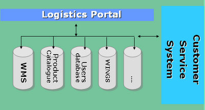
"back-end?"... Well, remember this diagram:
The portal website will be the front, through which the user and the customer service system will access data stored in several backend systems:
- The warehouse management system (WMS) which holds the data for all items stored in the warehouses. - WINGS (the corporate ERP system, running on SAP) holds procurement and invoicing data. - the customer database holds all data for each user logging in - the customer service system contains the data for each order - the product catalogue is a new system storing all specifications, pictures, manuals and manufacturer details for each product stored in the warehouses.
Several of you have worked with us in the past weeks to come to this result. If you compare the layout from the current portal tryout sites and the new one, you will agree with me: there is quite a difference! ;-)
Once again to everyone who participated in the "Graphic Nerds" working group: Andrea, Denise, Diana, Ekram, Eric, Eunju, Hetty, Jonathan, Julia, Mats, Maurizio and Nadia!
- 59 people voted for the 5 different layouts. - 74% of you thought the new layout was either "real cool" or "cool". Only one did not really like them. - The top 3 voted layouts were #2, #3 and #4 - The least liked layouts were #1 and #2
We presented the top three layouts to The Boss. He suggested two small changes and now... (taraaa!) we present to you the final layout (click for full resolution):
For those of you interested in the detailed poll outcome:
Overall impression of the layout: (total votes: 53) Real cool: 22% Cool: 52% Mmyah: 24% Sucks: 0%
Which layout(s) do you really LIKE: (total votes: 59) Mockup 1: 20% Mockup 2: 23% Mockup 3: 40% Mockup 4: 25% Mockup 5: 4% Which layout(s) do you really HATE: (total votes: 52) Mockup 1: 65% Mockup 2: 36% Mockup 3: 9% Mockup 4: 7% Mockup 5: 15%
It started off with a couple of layouts Mats made in Dubai, and then we worked in cycles to refine the different pieces which make a webpage look good and usable.
We gathered a group of interested logistics staff (those with the red hats) and webgurus (those with green noses), who commented on the the layouts through a discussion forum on Quickr.
Every week, we would gather for an hour, and agree on the different topics covered in the discussions, after which the graphic designers could further refine the mockups.
After three weeks, it came down to the little details, and we asked Ivan - one of the professional designers - to work for a day in the office (picture above). The end result is the designs people are now voting for.
Over the past four weeks, a working group of volunteering logistics staff and WFP "web people" went through several iterations of the graphic designs.
We have now finished our work.
Here are five variations ("mock-ups") of the same design, each with a different top banner. The main body of the page is always the same.
When judging the mockups, do not look at the contents. The text, pictures and the titles of the different headers are just dummies. What is important at this stage is to get an impression as to "if you would come to this webpage, how does it make you feel".
Click on each picture below, to see the full resolution of the mockup.
Vote for the most LIKED and the most HATED design.
You can leave a comments too. By clicking on "comments" at the bottom of this post...
All banners have the same body. Vote on the first poll if you like the overall look and feel or not. (click on the pictures to enlarge)
Summarized differences between the banners: Design 1: faded banner - dark Design 2: faded banner - light Design 3: clear banner - font 1 Design 4: same as #3 but with a different font in the banner Design 5: same as #3 but with another font in the banner
We had a big discussion today about the navigation system we wanted for the portal.
Both me and Peter are very persistent on what we want and if we feel we can't have something implemented because it is ”the way we work”, ”Our old standard system cant do that ” or ”we never did that so we don't want to do that” type of answer, then by default neither of us will ever give in ;-)
By coincidence we had seen a very good navigation system on a website for one of the potential suppliers we had shortlisted:
I think all people who saw the navigation agreed it would be a model for how we wanted ours to be. It is so smooth and have a pleasant way to expand out. The "only" thing different we wanted was to have Hover-over instead of clicking down in the navigation tree. Perfect we all thought and left it at that.
Yesterday Diana mentioned that there was a problem with the navigation when we hover. It would expand down but then jump in a crazy way when moving from one main group to another, especially if there was a lot of pages in between. I looked at it quickly but it looked simple enough to solve and I left it to think about over night. I could not see anything really problematic as the jumping itself we should be able to prevent with a smart code solution. Diana's boys are sharp so it might be more work but not impossible.
Today when coming back from another meeting one of the boys came over and wanted to chat more about it and I explained what I thought and the discussions got more and more heated. My smart coding solution did not really convince anyone. But ”yeah a smart coding might be the solution” Toby said and left the room in a voice and look on his face, saying ”This guy must be nuts”.
We ended the discussion without a solution but I could not stop thinking about it. I went back to the site we had found the navigation structure on. I was clicking away while thinking about how it would react if the clicks I made was already happening when I would hover the mouse over instead. Back and forth I tested to see what the problem would be. It was so smooth. I hover over and the menu expands down in a smooth very pleasant way. Then I go to the next main category... eh..eh... hmmm.. only then did I realize that if this was hover over, we would have created a menu that would make anyone leave the site and never come back, Ever.
If you have seen the small prank screens where they show a small pop-up window with a ”click here to cancel” button that you never can click as it moves when the cursor gets close. That is exactly what we would have created with our ”lets hover over expansion”.
What can I say : 10 points to Diana and her boys..
As we are working on the Logistics Portal, more and more ideas start popping up.
It is 4 am in the morning, and I'm reflecting on what just happened tonight.
We were having a technical problem with one of the news feeds (one of those things that display the "Latest News" on a website. I just could not figure it out. I went on the Internet and found a discussion forum specializing in "feeds".
I posted a message.
I take in a google news feed. In the Google news feed, the title is duplicated. How do I remove that?
Two hours later I got an answer from a guy, called HapDaniel. A guy I don't know. Don't know what he does for a living, nor where he lives. Never heard of him.
His answer was:
Try this:
In [item.description] replace [(?s)^(?(?=.*?<a.*?<img)(.*?</a>.*?)|(.*?))<a.*?</a>.*?</font><br>] with [$1] (omit all outer []s).
Now this is all gibberish to you, as much as it is to me. But I tried it, without knowing what I did, and... it worked.
What is the lesson learned? I had a problem, reached out to an Internet discussion forum, and asked a question in the void. From the void, the answer came and solved my problem. In two hours time.
In technical terms, we call these forums tools for "Communities of Practice".
My question to you is: what is the Community of Practice for logistics officers, our prime target for the Portal? Where do you, as a logistics officer in the field, turn to if you have a problem? How do you do that?
Where do you ask for "contacts in Dar es Salaam port"? Where do you find "the spare part for a Clark oil pump in Ouagadougou"? Where do you turn to if you want to know "who has experience with trucking company XYZ in Goma"?
You turn to people you know, probably. How? Call them up, email them? How fast do you get an answer? And what if you get no answer?
So where is that Community of Practice, where you Email a question, read by thousands of logisticians all over the world, and attended to by "those in the know"?
I don't think it exists.
That is one of the things we want to accomplish with the new Logistics Portal... Build that Community of Practice, and give it the tools it needs to function. So we can concentrate on stuff that is really important in our job. Our humanitarian goals. Rather than "where to find a fuel pump in Ouagadougou.
The development of the new portal is done by the ICT department. We call them "Diana and her boys".
We, on the business side, define the requirements. They, on the systems side, develop solutions based on our requirements.
The better the requirements, the better the solutions will be. Crappy specifications guarantee crappy software.
The challenge is often for "those on the business side", to define the requirements good and clear enough, so that the developers can write their software. Sometimes we feel we speak different languages.
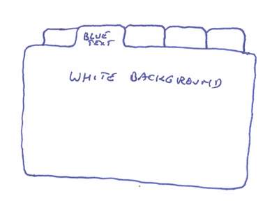
Today, we had a discussion on how we want the tabs at the bottom of a Portal page to look like. We did not understand each other. Even more complex as the graphic designers work off-site.
So we made a drawing, scanned it, and sent it by email them. Looking back, the drawing looks funny. It is almost like a cartoon.
Well at least we find it funny. Do you think we are turning into nerds?
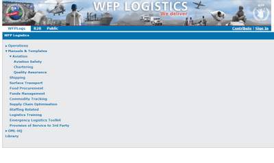
We have released the Portal tryout sites for internal use since a while. These sites are labelled as "tryouts" as they are not "the final thing yet".
It was a test to gain experience in the web development and information management for the "big" portal, first release scheduled end December this year.
We are getting our feet wet on many different levels:
Gathering all available information, tracking who is the owner of the material, who updates it, who checks for consistencies
Exploring the technical tools available to actually construct the website
Exploring different ways to support and manage the website
Anyone who constructed a website will be familiar with these challenges, no?
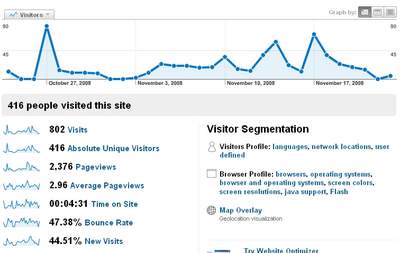
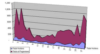
One of the tools we implemented on the Portal tryout sites is "Google Analytics", a freeware webmaster tool, tracking the usage of the portal. This helps us track which parts of the Portal are accessed the most, which type of documents are used the most, the way users navigate through the site, the duration of "a visit" on particular pages, etc... This helps us identify issues and optimize the design of the website. It is also a monitor to see "how much this tool we built is actually used"...
So, every week, Evy runs the statistics on the use of the tryout sites, which look like this:
She then pours the information in a simple spreadsheet that allows us to track -on a weekly basis- the amount of visits the website has, and how many pages are being viewed:
As you can see in the graphs, last week the Portal had 155 visitors, viewing over 800 pages. Not bad if you consider the site has only been released for internal use, to WFP logistics officers!
"DELIVER" is our codename for a project consisting on the design of a global WFP logistics system, support WFP's logistics operations, one of the core services we provide in support of our humanitarian mission.
DELIVER is not one programme, or one system, it is a set of projects ensuring the WFP logistics officers can store, track, and retrieve the data related to the procurement, storage and transport of both food and non-food items all the way to the end delivery point in the "deep field".
Many of these systems existed, but were not connected to each other. Others were non-existent, so we need to develop them. Yet others existed, but were not sufficient. These are, what we call, the "back end systems": systems which all perform one, or a set of, isolated tasks.
The DELIVER project will provide a common platform where any WFP logistics officer can access the data he/she needs to perform his/her job.
We achieve this, by connecting all these "back end systems" to a common "Data Interchange Bus", enabling data to be exchanged between the different systems.
The way the data is delivered to the users, is through a "the Portal", a large website, where data can be retrieved from or entered into the different backend systems.
Similarly, a customer service system will have an overview of the workflow of the different logistics operations.
 It looks like we've locked onto a solution for maintaining a blog within our new portal. By using an iframe we can quickly and easily integrate a blog into the portal structure while still retaining the attributes of the original blog platform.