Showing posts with label graphic design. Show all posts

And the winner is....


Thank you all for voting on the different graphic layouts.

Several of you have worked with us in the past weeks to come to this result. If you compare the layout from the current portal tryout sites and the new one, you will agree with me: there is quite a difference! ;-)

Once again to everyone who participated in the "Graphic Nerds" working group: Andrea, Denise, Diana, Ekram, Eric, Eunju, Hetty, Jonathan, Julia, Mats, Maurizio and Nadia!

- 59 people voted for the 5 different layouts.
- 74% of you thought the new layout was either "real cool" or "cool". Only one did not really like them.
- The top 3 voted layouts were #2, #3 and #4
- The least liked layouts were #1 and #2

We presented the top three layouts to The Boss. He suggested two small changes and now... (taraaa!) we present to you the final layout (click for full resolution):
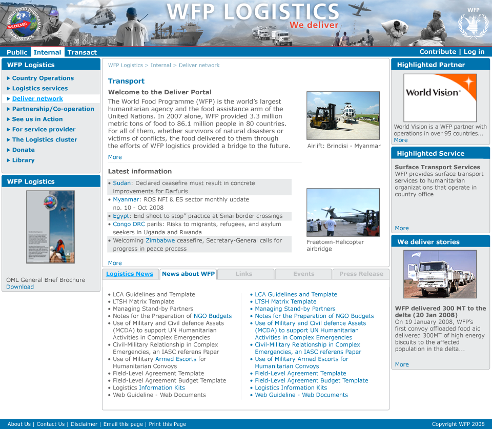
the final layout - click for full resolution

For those of you interested in the detailed poll outcome:

Overall impression of the layout:
(total votes: 53)
Real cool: 22%
Cool: 52%
Mmyah: 24%
Sucks: 0%

Which layout(s) do you really LIKE:
(total votes: 59)
Mockup 1: 20%
Mockup 2: 23%
Mockup 3: 40%
Mockup 4: 25%
Mockup 5: 4%

Which layout(s) do you really HATE:

(total votes: 52)
Mockup 1: 65%
Mockup 2: 36%
Mockup 3: 9%
Mockup 4: 7%
Mockup 5: 15%

Graphic stuff.. almost done.


Ivan Mats and Peter working on the graphic stuff
(L-R: Ivan, Peter and Mats)

It started off with a couple of layouts Mats made in Dubai, and then we worked in cycles to refine the different pieces which make a webpage look good and usable.

We gathered a group of interested logistics staff (those with the red hats) and webgurus (those with green noses), who commented on the the layouts through a discussion forum on Quickr.

Every week, we would gather for an hour, and agree on the different topics covered in the discussions, after which the graphic designers could further refine the mockups.

After three weeks, it came down to the little details, and we asked Ivan - one of the professional designers - to work for a day in the office (picture above). The end result is the designs people are now voting for.

Our graphical layout - Five choices


Over the past four weeks, a working group of volunteering logistics staff and WFP "web people" went through several iterations of the graphic designs.

We have now finished our work.

Here are five variations ("mock-ups") of the same design, each with a different top banner.
The main body of the page is always the same.

When judging the mockups, do not look at the contents. The text, pictures and the titles of the different headers are just dummies. What is important at this stage is to get an impression as to "if you would come to this webpage, how does it make you feel".

Click on each picture below, to see the full resolution of the mockup.

Vote for the most LIKED and the most HATED design.

You can leave a comments too. By clicking on "comments" at the bottom of this post...

All banners have the same body. Vote on the first poll if you like the overall look and feel or not. (click on the pictures to enlarge)

Summarized differences between the banners:
Design 1: faded banner - dark
Design 2: faded banner - light
Design 3: clear banner - font 1
Design 4: same as #3 but with a different font in the banner
Design 5: same as #3 but with another font in the banner


Mockup #1: faded banner - dark

mockup1 - click for full version

Mockup #2: faded banner - light

mockup2 - click for full version


Mockup #3: clear banner - font 1

mockup3 click for full version


Mockup #4: clear banner - font 2

mockup4 - click for full version


Mockup #5: clear banner - font 3

mockup5 - click for full version

The graphic look of the Portal takes shape


Gradually, the graphic design of the new portal takes shape.

Here is how the current portal tryout sites look like (screenshot)

old portal

This is what the new one will look like.

portal graphic mockup

We're not quite there yet. The top banner still needs tuning. But we are getting there.